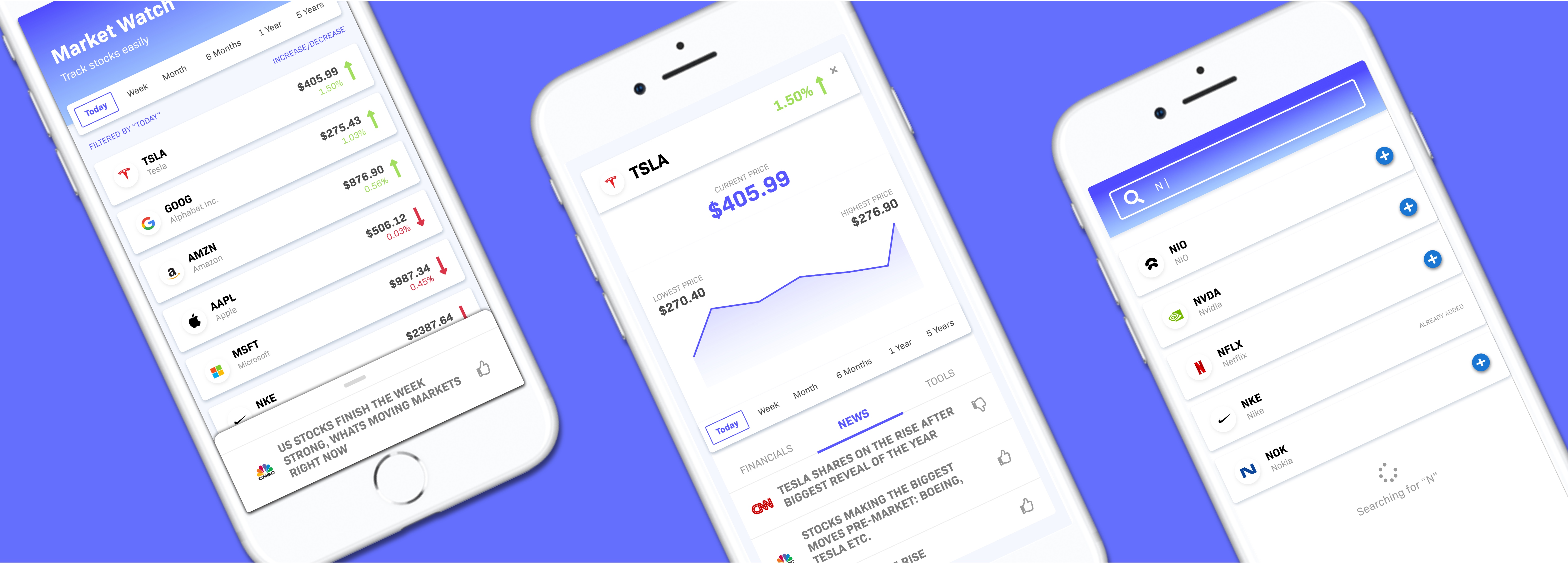
A case study that explores the problem at hand, research, low and hi fidelity wireframes, visual redesign and a prototype in Framer.

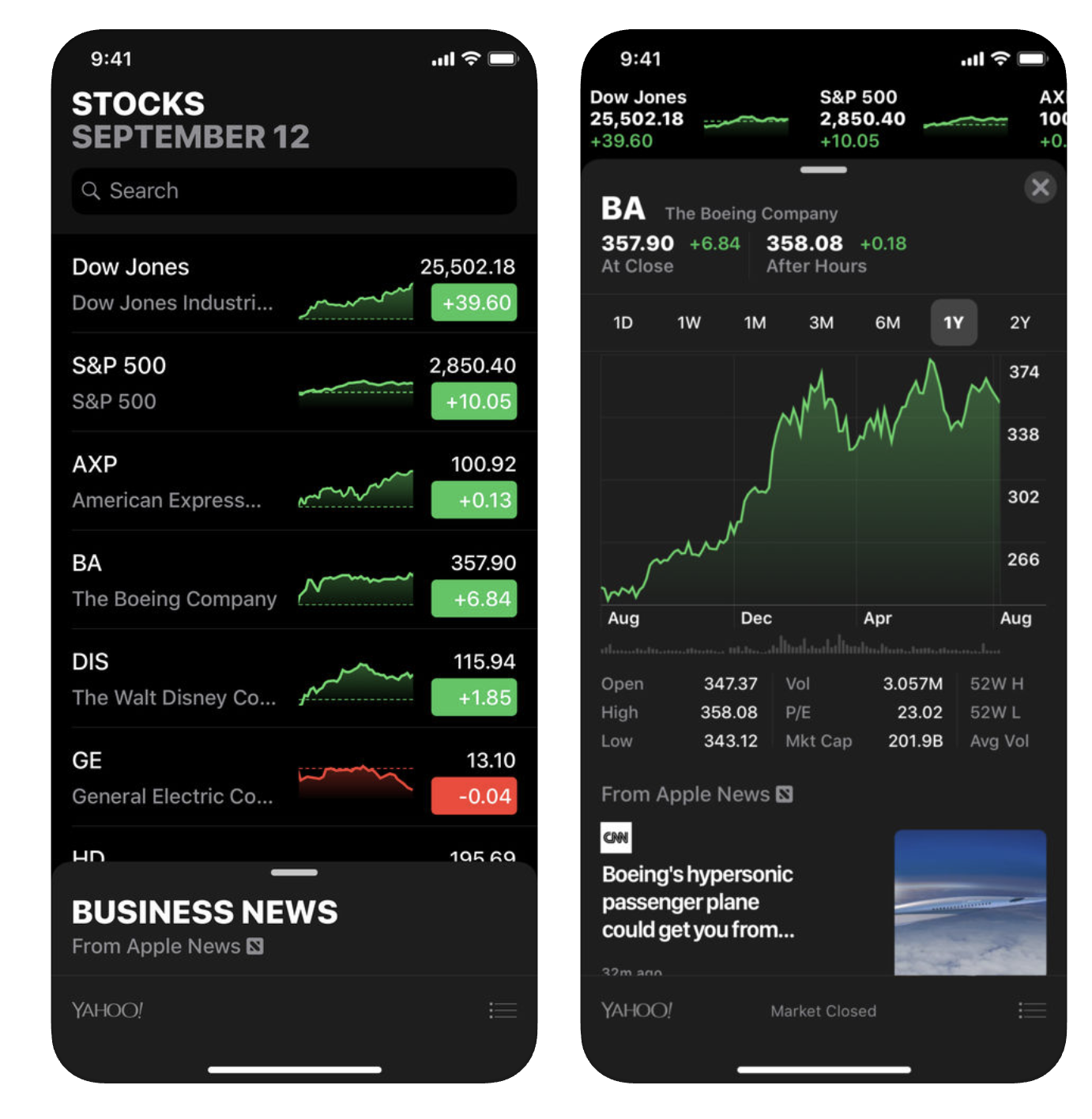
Apple's Stocks application lacks inclusivity, particularly for those who have little to no experience with the Stock Market. The stock market can be very complicated, and "Stocks" does a fantastic job of simplifying the interface to be usable and the information digestable. However, I chose to redesign the application to support features that increased "Stocks" inclusivity.
I broke down the features of the application by the assumptions it makes and tested these assumptions with others by having them communicate with me what they don’t understand about the application/what is a frustrating user experience.
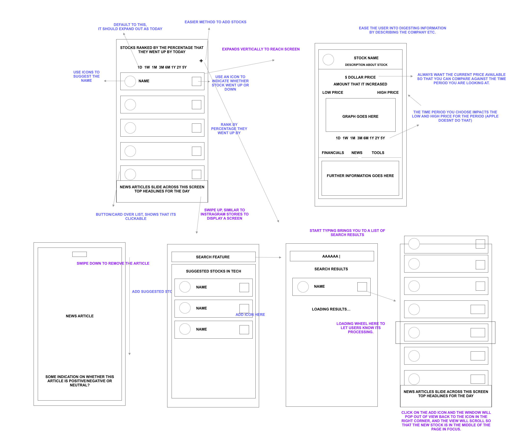
Based on the points above, I produced lo-fi wireframes to communicate how I think the application should work/what features it should have that break down the exclusivity. These features include having more analytical tools, providing context clues and hiding large amounts of information.
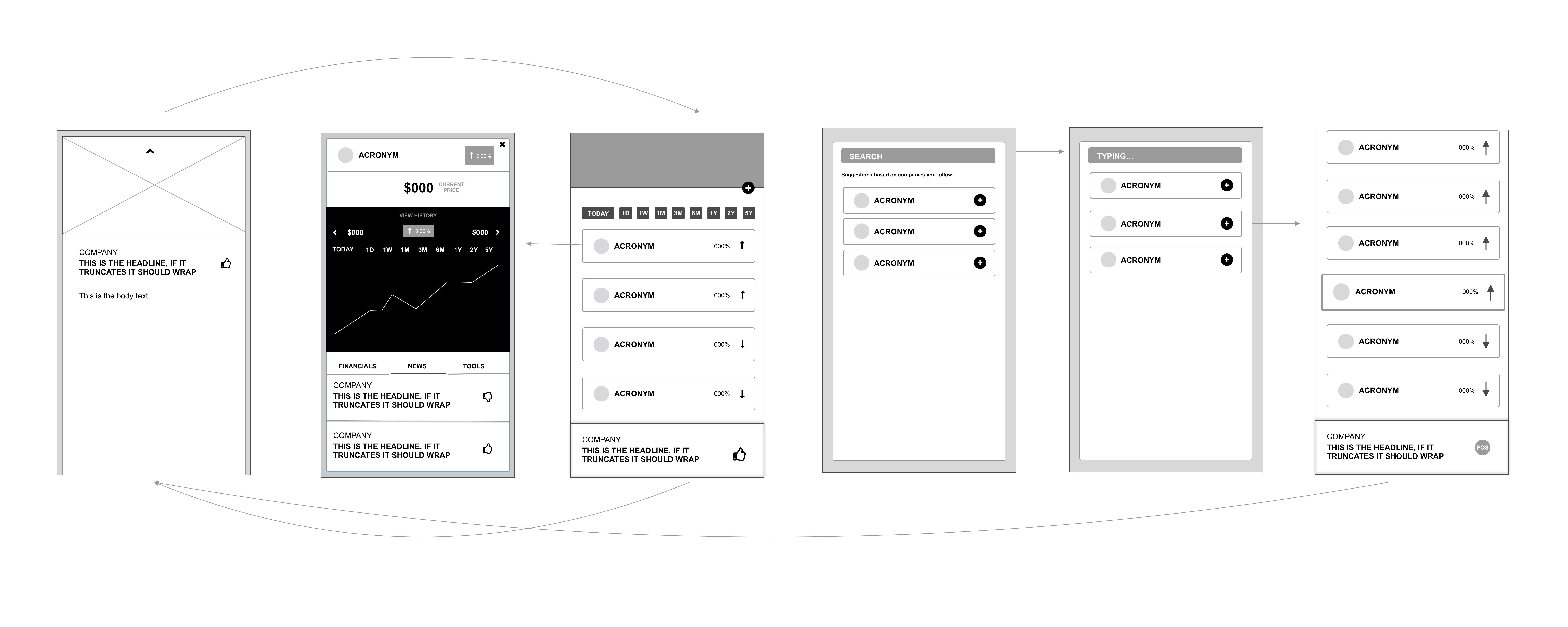
As part of my design method, I will typically create a mid-fi wireframes before moving onto hi-fi wireframes. These will shade out areas on a scale of light, moderate and dark based on the importance of that area. This provides context for visual decisions.
The visual design decisions were made on the basis of designing a more inclusive application. Firstly, the dark colors needed to go. I tried to use as much white as possible, for example to distinguish cards I used a white fill and a box-shadow. I gave the bright reds and greens an opacity to dull down their energy.

These Hi-fi wireframes add the visual design choices to the mid-fi wireframes.
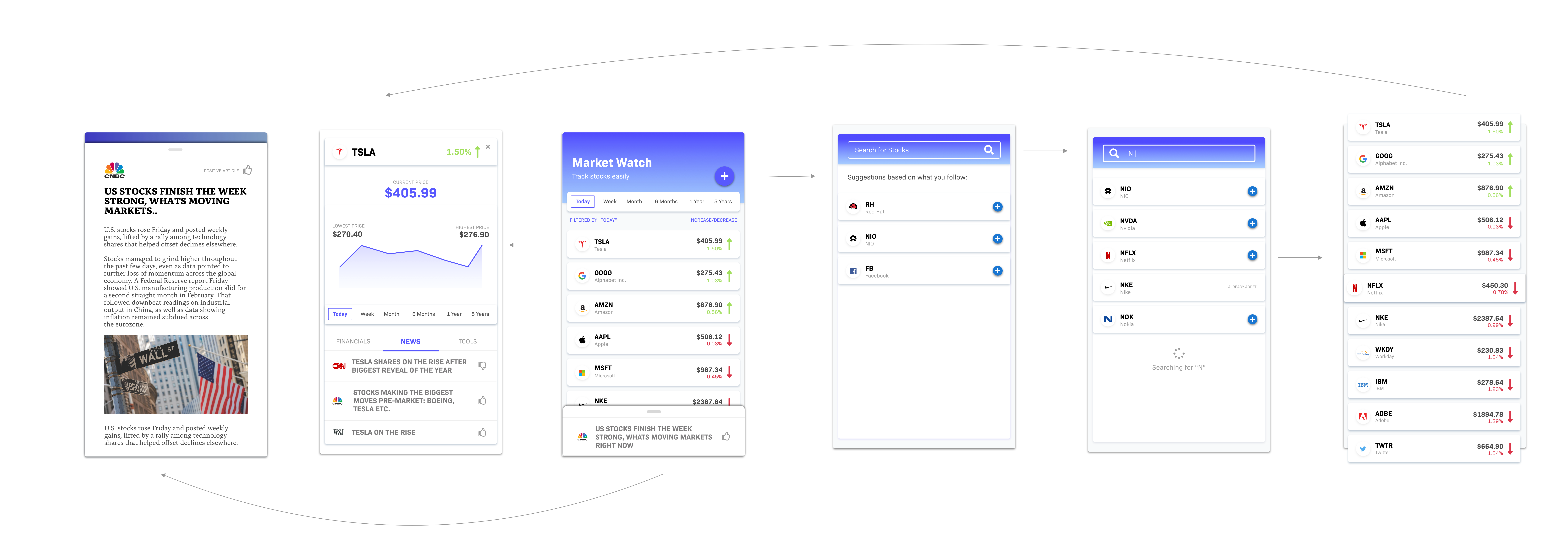
Adding context clues were necessary to break down the assumption that companies are described by an acronym. I added the logo, and a description underneath the acronym to supplement it.

This feature was added to demonstrate to the user that stock growth is time based. Toggling through these time periods allows the user to compare stocks based on their growth over different times.

I decided to remove the graphs and replace them with up/down arrows as I thought the graphs were too much information for a new user to digest, and they can view a larger more interactive graph within one tap.

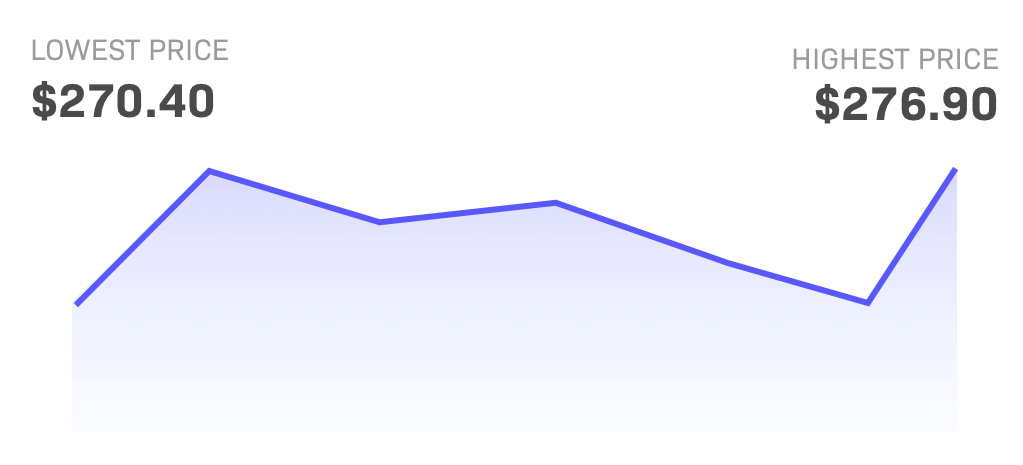
Within a stock page, the user can toggle between different time periods for that stock. Currently on "Stocks" the page lacks hierarchy with over 20 different numbers at the same type scale. I wanted to change this by increasing the scale of the most important numbers per period, so I scaled by the lowest and highest price for that time period. I believe this hierarchy brings importance to the numbers.
In "Stocks" there is large amounts of information on each page, which is not necessary for every user, everytime they open the application. I used tabs to store this information in a place that is easily accessible.

Using Framer I protoyped a simple version of interactions between screens.
I tested the prototype on 5 users who meet the criteria (are knew to stocks) and 100% of them said that all 5 features made for an inclusive application.